About
Balanced Body is an internationally recognized resource for Pilates equipment and education. In April 2026, they launched its new LMS, CLARA, for students enrolled in its courses.

The Core by Balanced Body

CLARA...serves as a one-stop-shop for students during and after the completion of the Instructor Training courses. Students will be able to access their digital manuals, videos, and supplementary course material all through this one platform.
Problem
As a student investing in their certification program, navigating the platform was time-consuming and confusing.
During my initial walkthrough, there was unnecessary friction, such as competing pathways to the same content, no way to pick up where I left off between sessions, and no sense of progress toward my certification.
Core Features
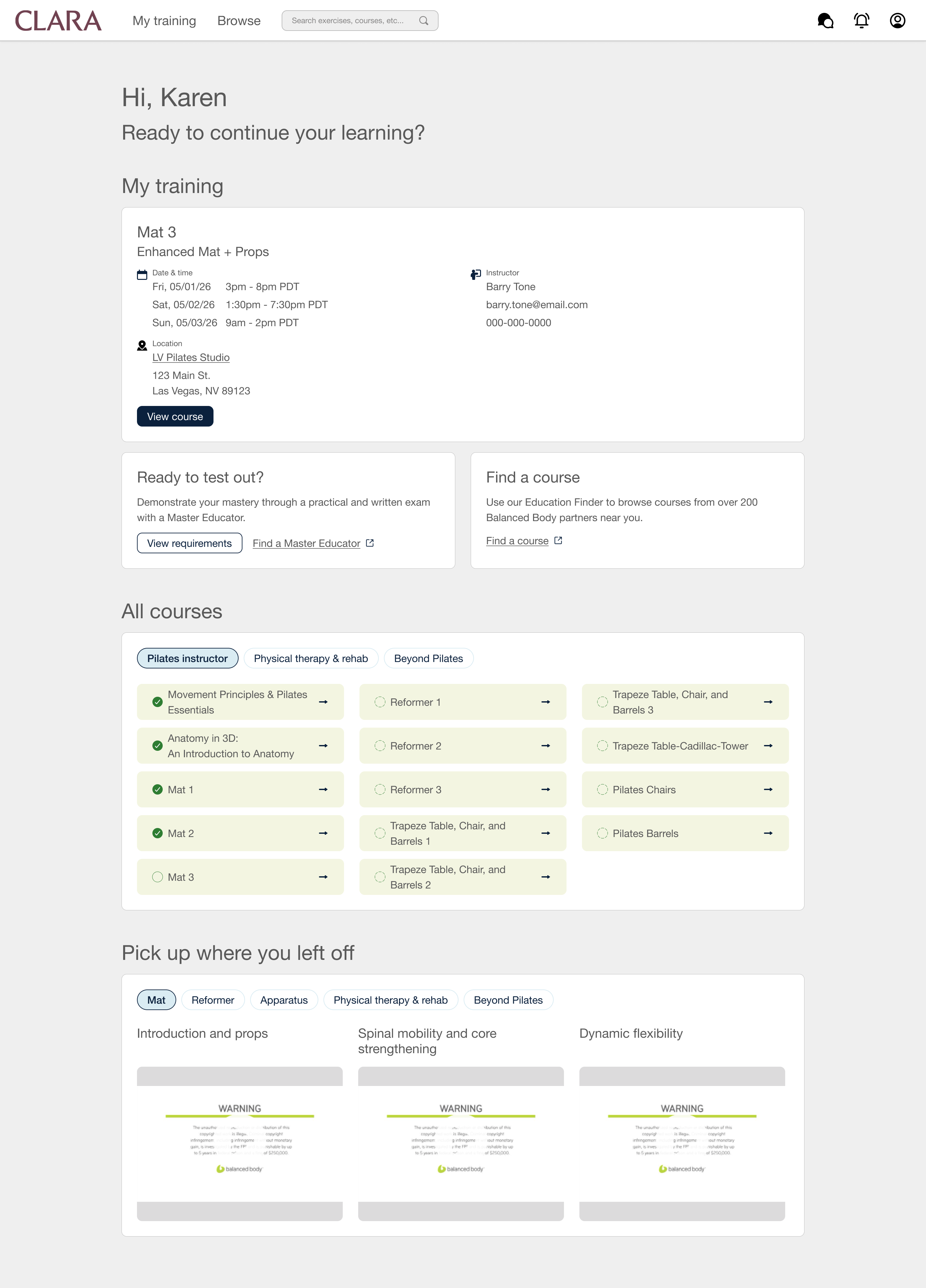
A comprehensive dashboard
View details about your upcoming training, course progress, and access recently watched videos.
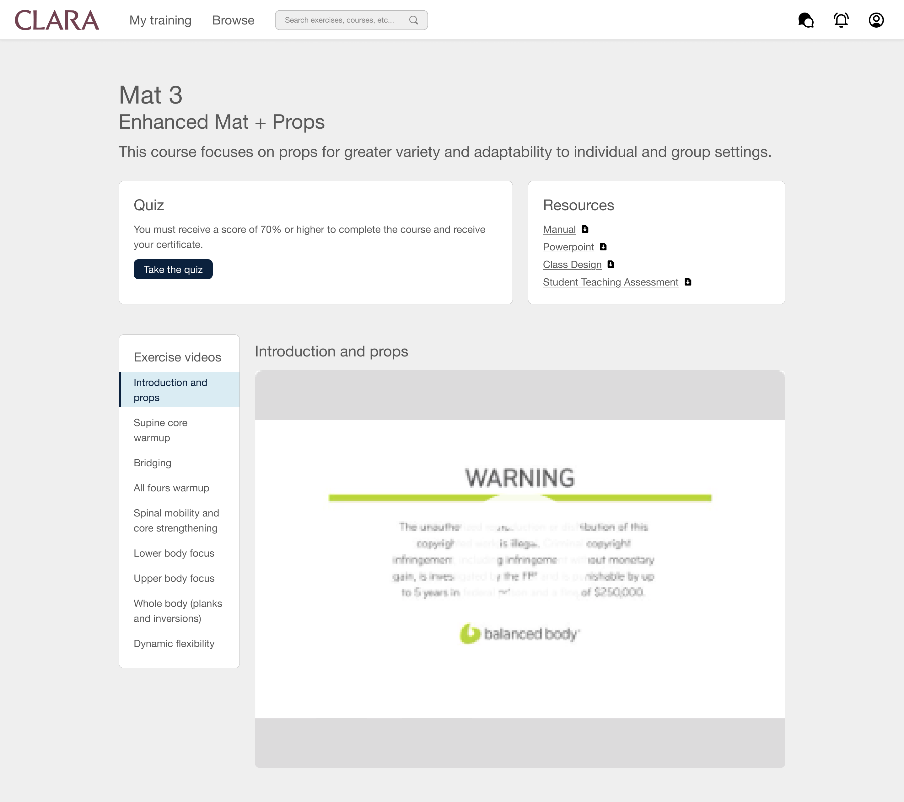
Simplified course view
Keep all course material visible for when you’re going through training or need a quick reference.
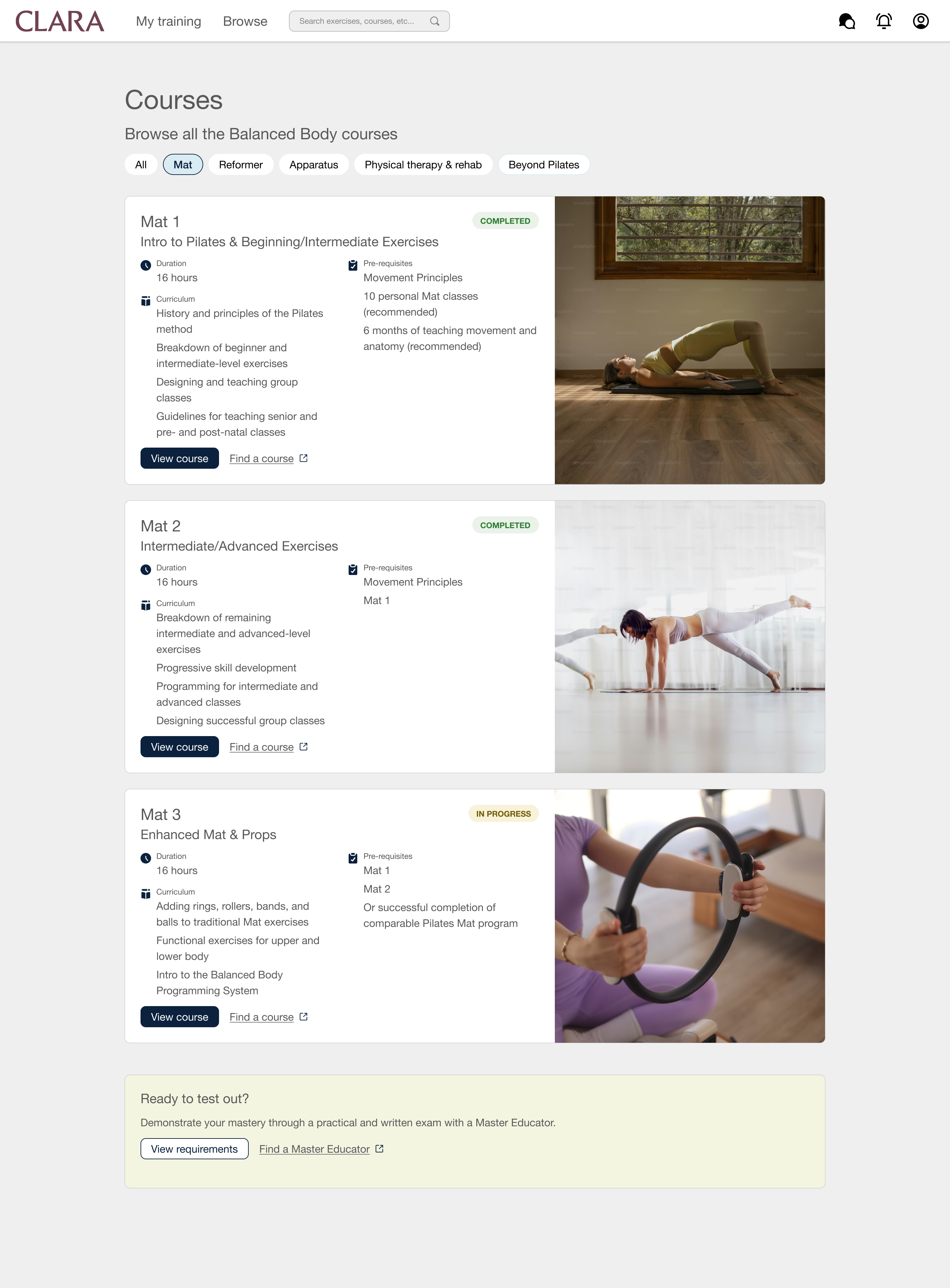
Browse courses
Learn about other courses without needing navigate to outside of the platform.
Discovery
Since the platform was launched with a gradual rollout, I relied on firsthand experience as my primary research method, along with conducting a heuristic evaluation and cognitive walkthrough of the platform.
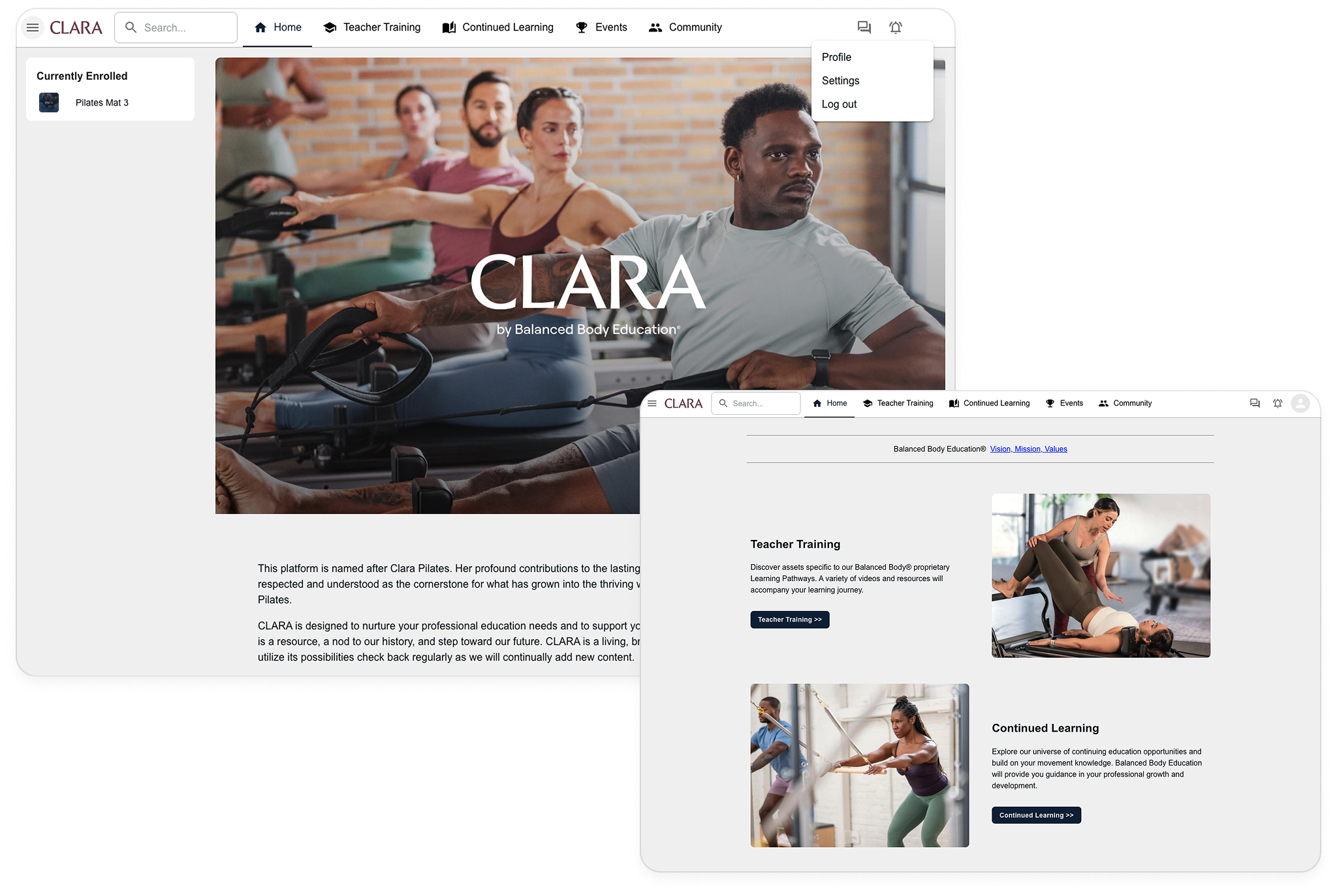
CURRENT
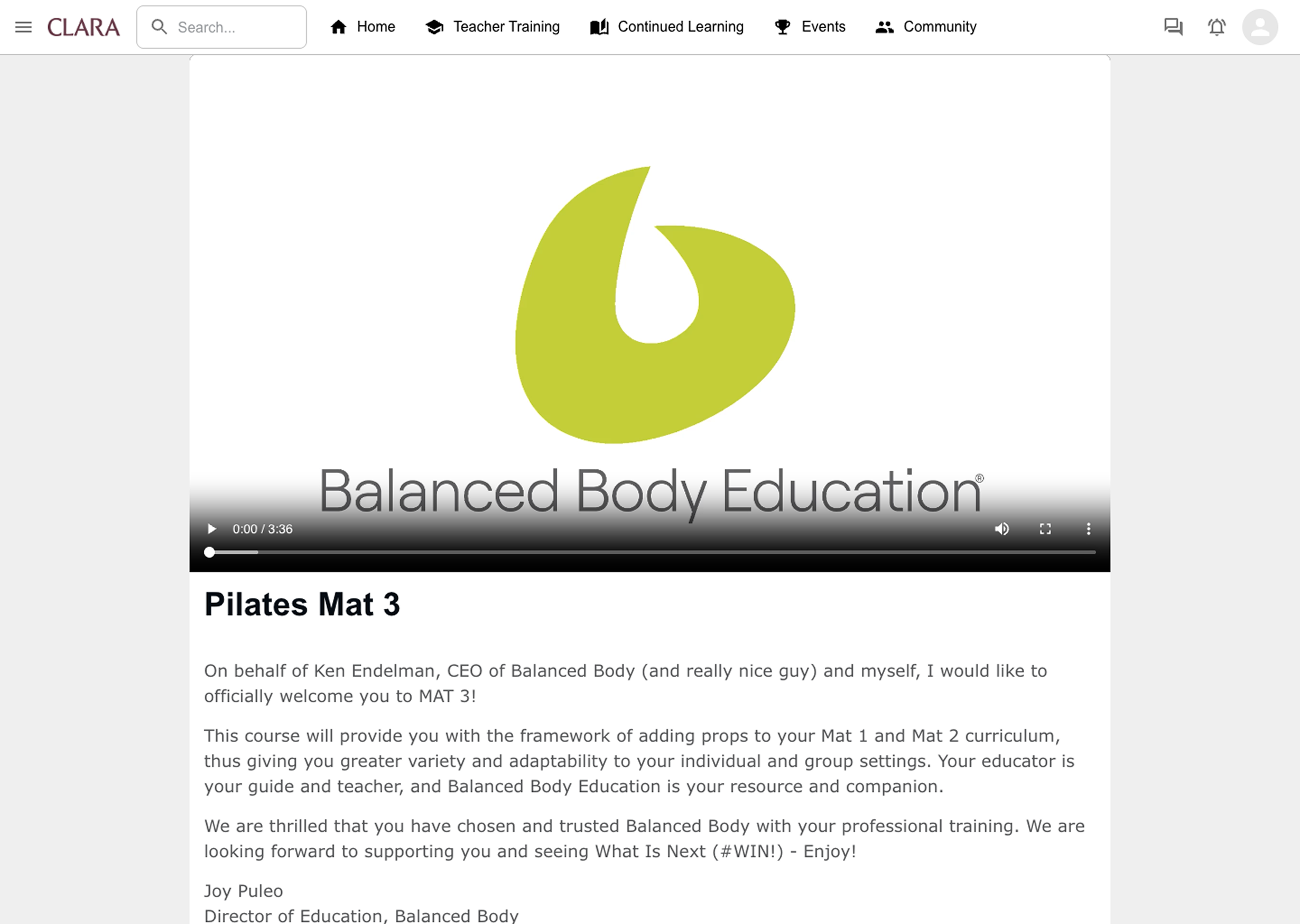
Home
Upon logging in, you meet the same content that wasn’t particularly helpful when looking for specific course material or wanting to get quick information.
CURRENT
Course
Similar issue with the homepage. Once you find your course, you immediately see the same intro video context each time above the course material.
Users


Student instructors
“I want to become a certified Pilates instructor.”


Instructors upskilling
“I want to expand my current skills and knowledge.”


Personal practice learner
“I want to learn more to improve my own Pilates practice.”
Key findings

Competing pathways
There are three ways to find and access course material, but they only create confusion.

Re-entry friction
There's no way to pick up where you left off between training weekends.

No certification progress
Students don’t get a sense of their certification progress.
In a nutshell...
The platform required a lot more exploration than anticipated and did not feel like a one-stop-shop like Balanced Body intended.
Goal
Redesign the platform to emphasize
quick scanning, reduced exploration, and visible progress.
Iterations
Navigation
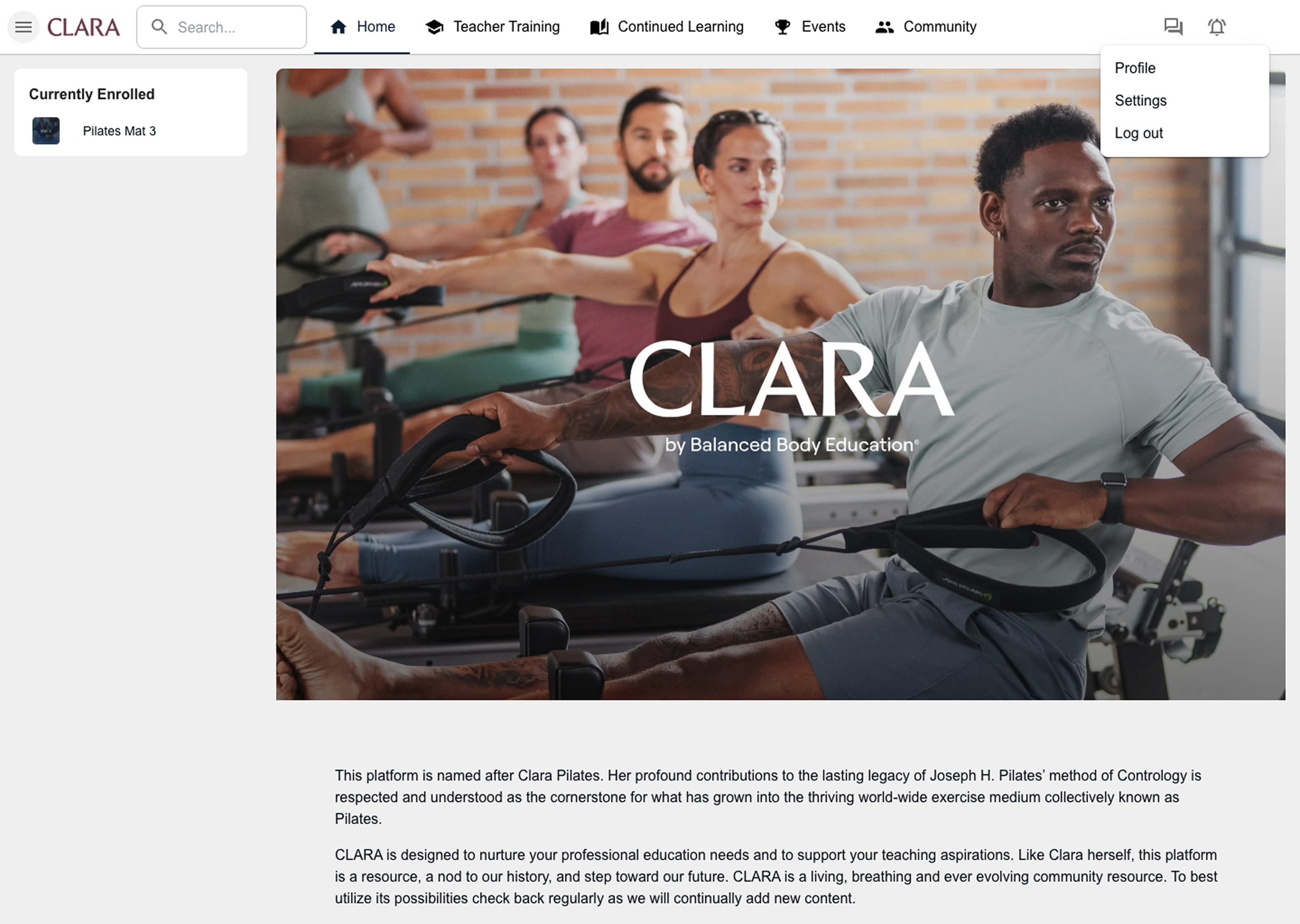
The nav bar felt overwhelming and was difficult to scan. The hamburger menu misleads people to think there are more options and some of the tabs sounded similar.
I removed the menu icon, reduced the visible options, and moved secondary features such as Events and Community were consolidated into the profile dropdown to keep primary navigation simple and focused.
CURRENT
All options

EXPLORATION
Simplified
Home
Rather than seeing the same content each time you log in, I aimed to present important information that’s easily scannable to avoid unnecessary searching.
CURRENT
Static content
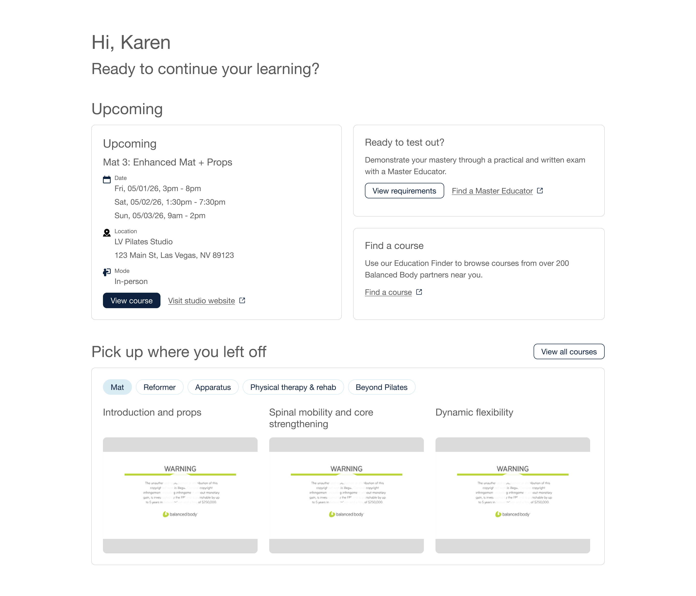
EXPLORATION
Quick scanning
Course
The course view was unnecessarily complex. Not only did I have trouble finding my course, I still had to ‘Enroll’ in it. The view provides step counters as if there’s a linear progression, but the content didn’t need it.
My goal was to remove the complexity and make all the content visible.
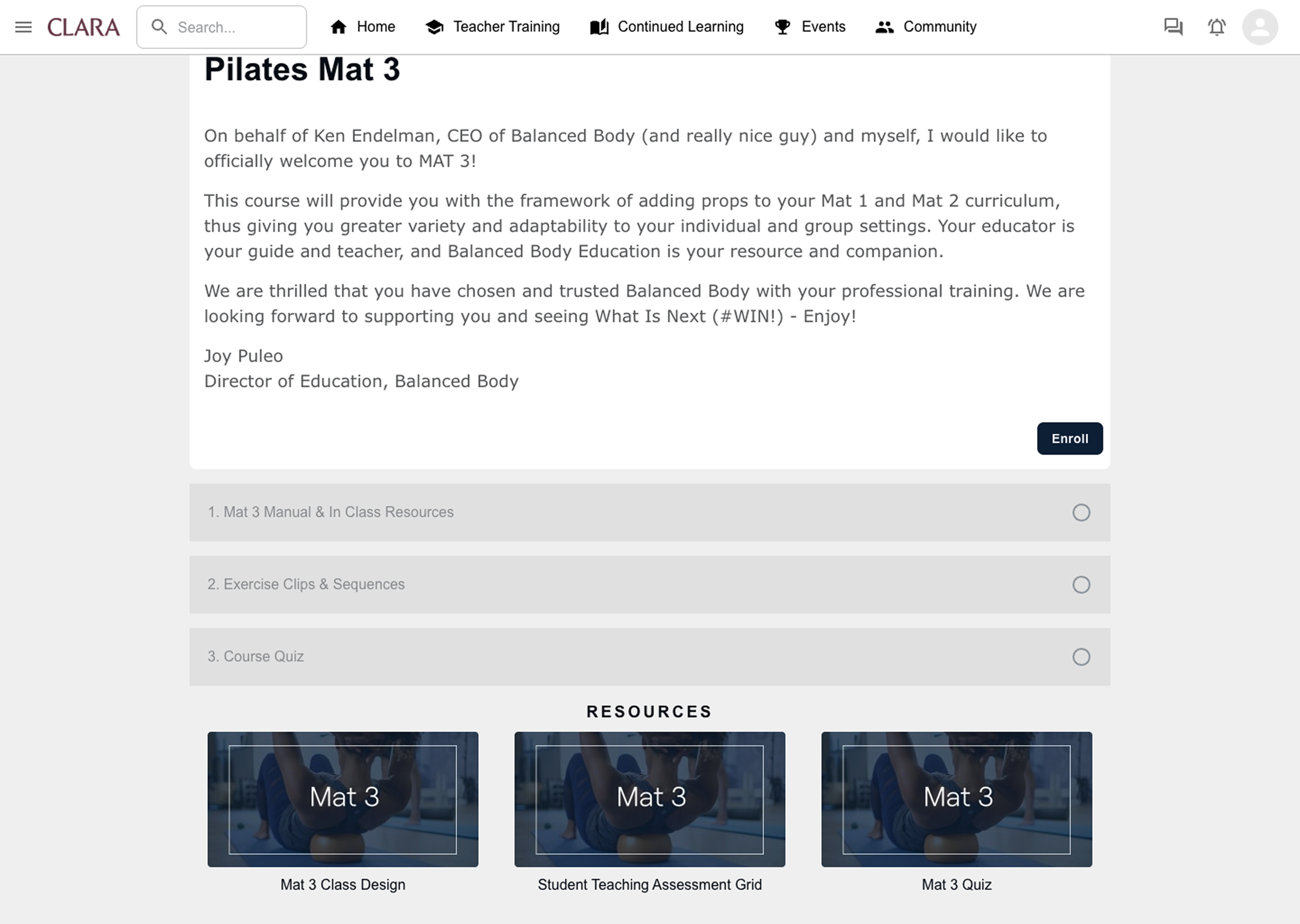
CURRENT
Complexity
EXPLORATION
Increased visibility
Final design
The redesign addresses CLARA's core navigation, progress tracking, and visual consistency problems across three screens.
Homepage as a certification dashboard
Simplified nav bar
Access the most important features right from the get-go.
My training
View your next course or see what's next in your certification journey.
Pick up where you left off
Access recent courses and videos without having to browse.
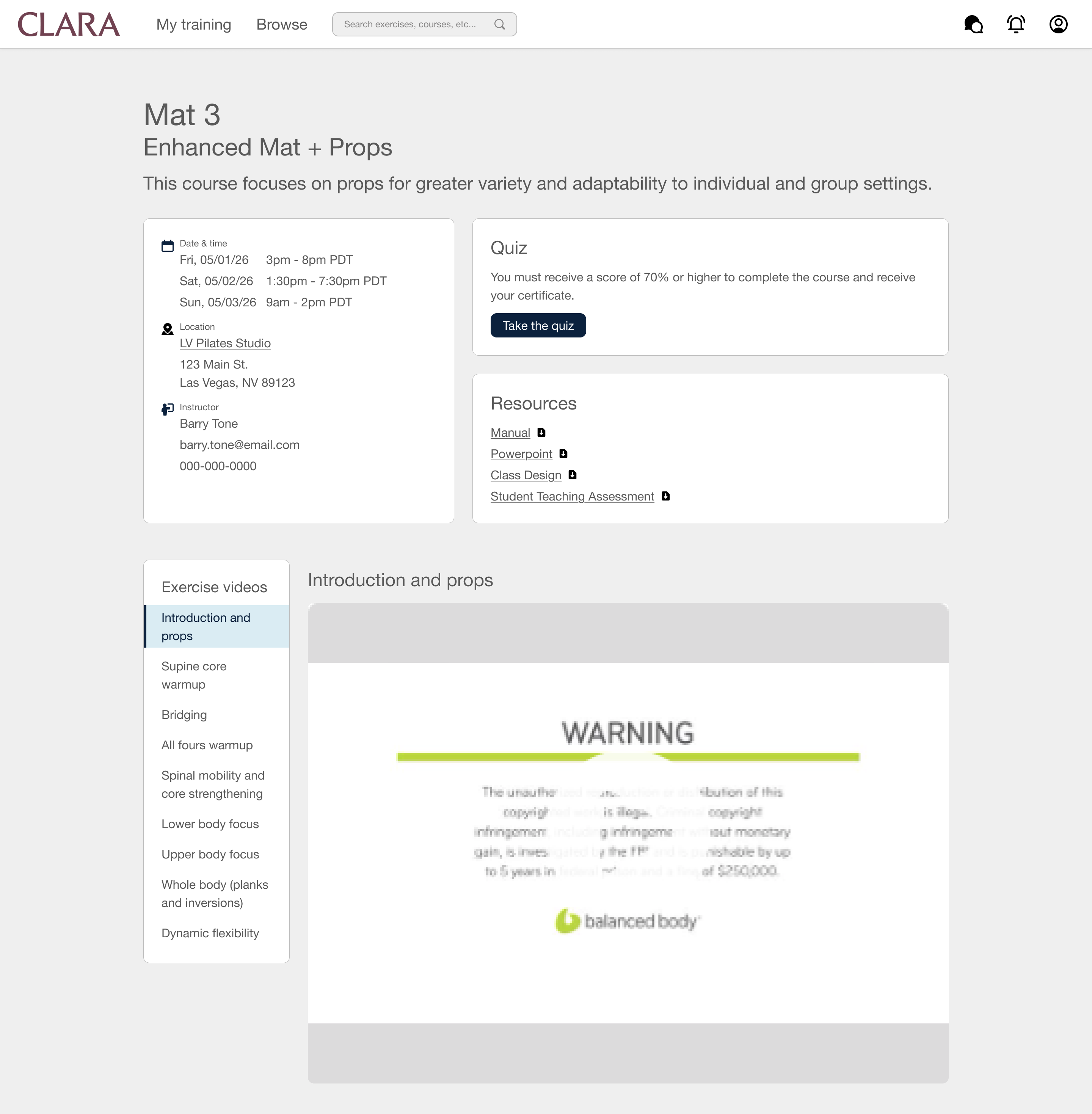
A single source of truth
Single screen
All the course content distilled in a single screen with a persistent sidebar to navigate the videos and reduce cognitive load.
Quiz and Resources
See what’s needed to succeed in the course and receive your course completion certificate.
Browse and preview all other courses
Course cards
See course details and enrollment status at a glance.
Find a course
The link redirects you to the Education Finder to search and register to keep CLARA focused on learning.
Impact
Since this is a concept project, there’s no live metrics to report, but the redesign makes measurable improvements to the experience:
Clear pathways
Removed the hamburger menu and moved course access onto the homepage.

Seamless return
Pick up where you left off brings you back to your last video, so returning students don't have to re-browse.
Immediate visibility
All courses show clear completion statuses without piecing it together manually.
If shipped, success is:
Faster access to course material, less friction navigating the platform, and clearer visibility into upcoming courses and next steps.
Reflections
I would’ve liked to have designed a certificate timeline or map, but without thinking through how I could track everyone’s end goal, it would’ve been difficult. In addition, I would’ve loved to have worked with Engineering to fix the broken search logic for a more efficient experience.
This project gave me an unusual research advantage as an active user. Every friction point I identified was something I experienced in real time as a student instructor preparing to teach. This dual perspective as both designer and learner allowed me to redesign the platform to align more with Balanced Body’s intentions.