
The Challenge
Our internal team has the ability to cancel visits on the patient’s behalf due to emergencies, technical difficulties, and last minute provider unavailabilities. Currently, cancelling a visit also involves writing visit remarks about the cancellation and issuing reimbursements, if applicable—all in different locations of the EMR. There's no one location to easily cancel visits, manage reimbursements, and track its status. This manual workflow requires substantial cognitive load that introduces preventable errors that may require additional time to identify and correct mistakes.

Internal Admin Data

"Over a 7-month period, our admin team cancelled an average of 33 visits per day and manually added visit credits an average of 65 times per day — all across disconnected areas of the system."
Key Findings
No accessible historical record
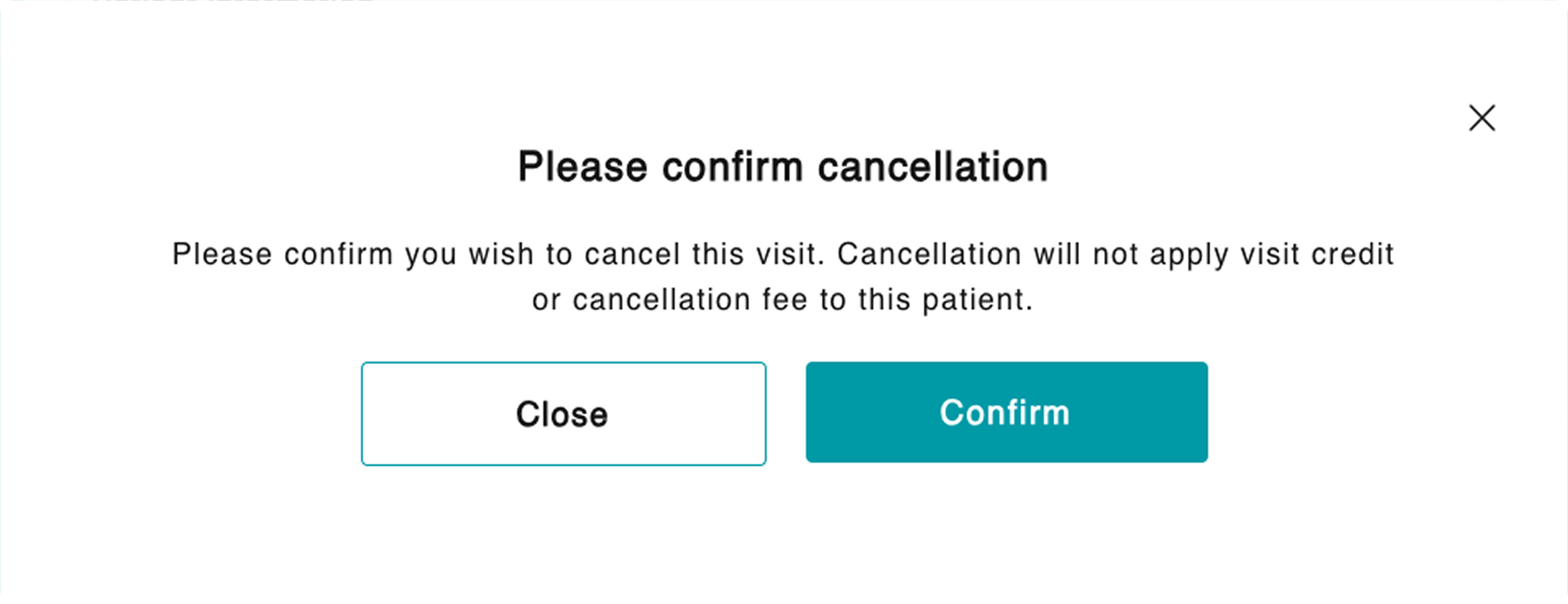
When cancelling a visit, only one popup shows. Once cancelled, the visit is removed from the schedule and the user must enter the reason in a different area of the app.
This simple process makes it difficult if users ever need to backtrack.
High cognitive load
A patient can request either a full refund back on their payment method or receive credits for their next visit.
This is done after a successful cancellation, but since there’s no accessible record, users must dig up or recall the specific visit type, cost, and if credits were used.
High error risk
All these issues combined is a recipe for high risk of human error since the current workflow happens in different places within the app and outside with our third-party payment provider.
The original sole popup for cancellation
Approach
1
Understand the different policies and use cases
By creating a user flow, I could easily visualize the multi-step process and areas where we could consolidate.
Then, I could ask more detailed questions around the cancellation/refund policy, fees, and different use cases.
2
Explore with guardrails
Since money is involved, I made sure to provide guardrails to prevent human error whenever calculations are involved.
3
Present potential solution to stakeholders
This feature was started, then deprioritized, and back on the roadmap over the timespan of 6 months.
Teams and policies have changed during this time so it was important to finally get these screens in front of people to see if they aligned with their expectations.
Results
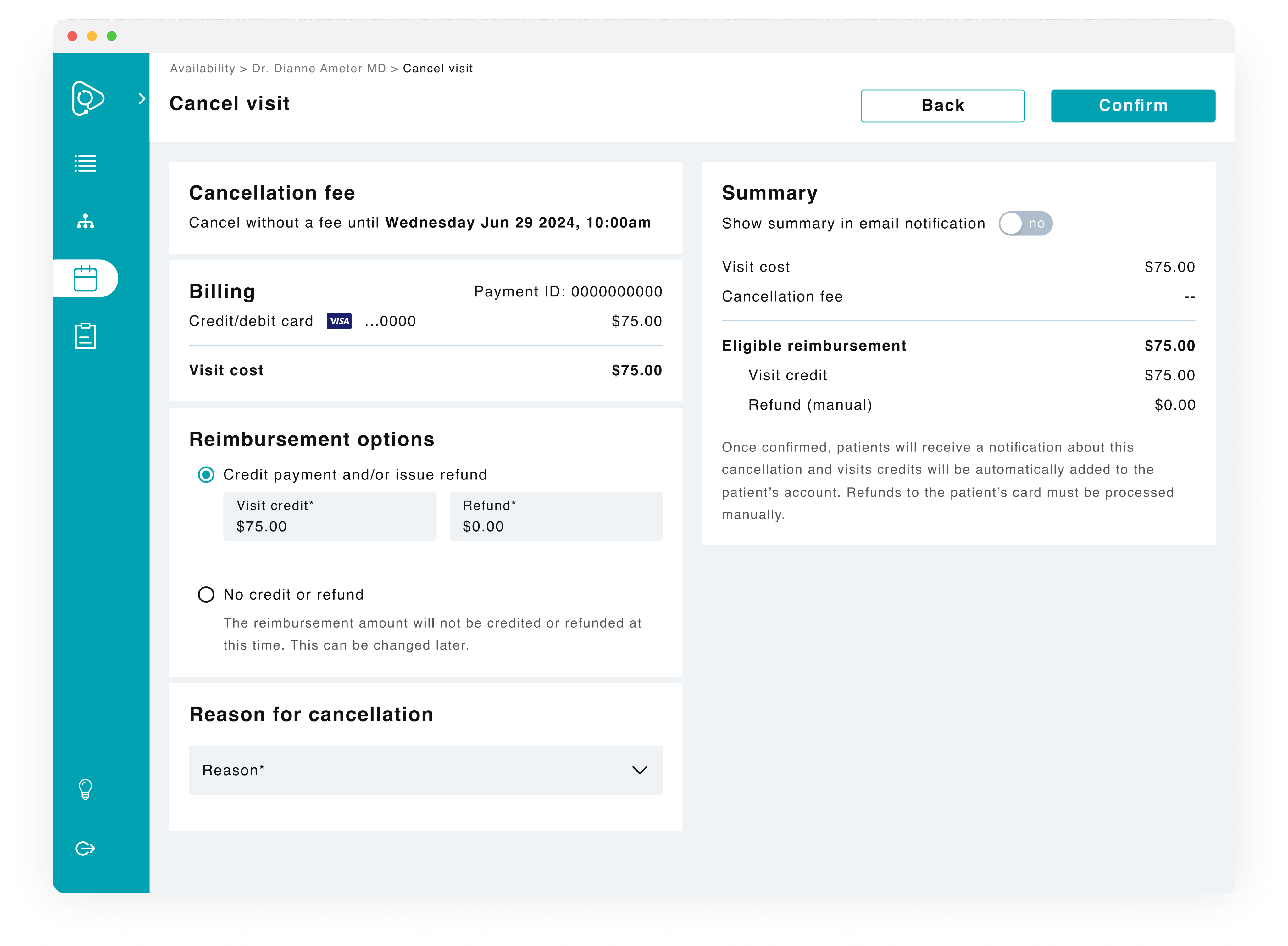
A one-stop shop for cancelling visits, managing fees, and reimbursements. This solution was successfully implemented and reduced the need for manual calculations, memorizing different fees, and provides a way to see historical information.
Dedicated cancellation page
Having a dedicated page allows users to easily track and manage cancellations in one place.
Visible data
A patient can request either a full refund back on their payment method or receive credits for their next visit.
This is done after a successful cancellation, but since there’s no historical record, users must look up or recall the specific visit type, cost, and if credits were used.
Auto-calculations
To prevent human error, the system automatically calculates reimbursement amounts and displays the breakdown so for transparency.
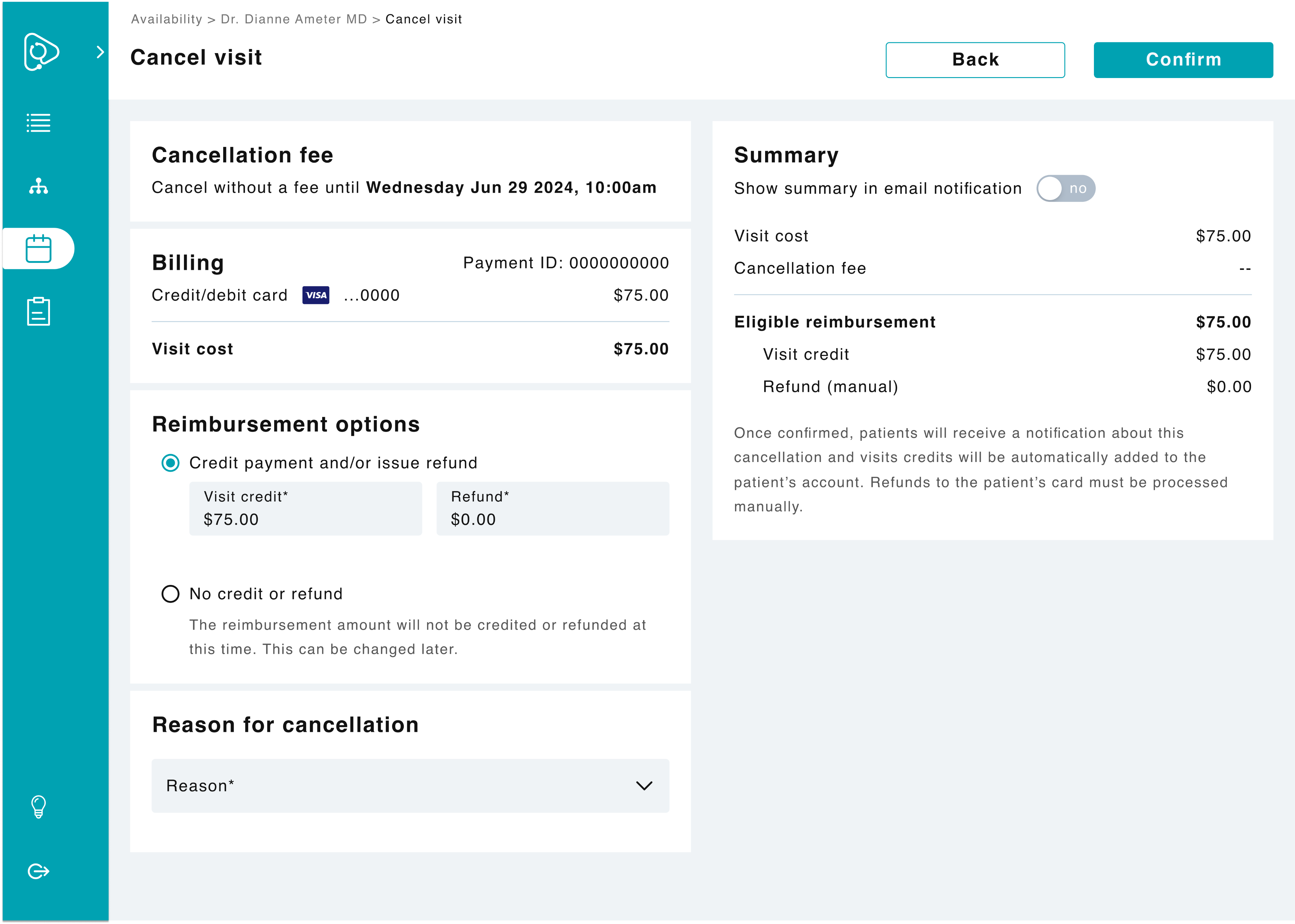
Cancellation page for visits without a fee.
Option to override
For cancellations where fees apply, users have the option to unapply a fee for flexibility.
Prioritizing recognition
To reduce cognitive load and prevent errors, I added contextual helper text at key decision points. This reminds users of next steps without requiring them to leave the page or recall policies from memory.
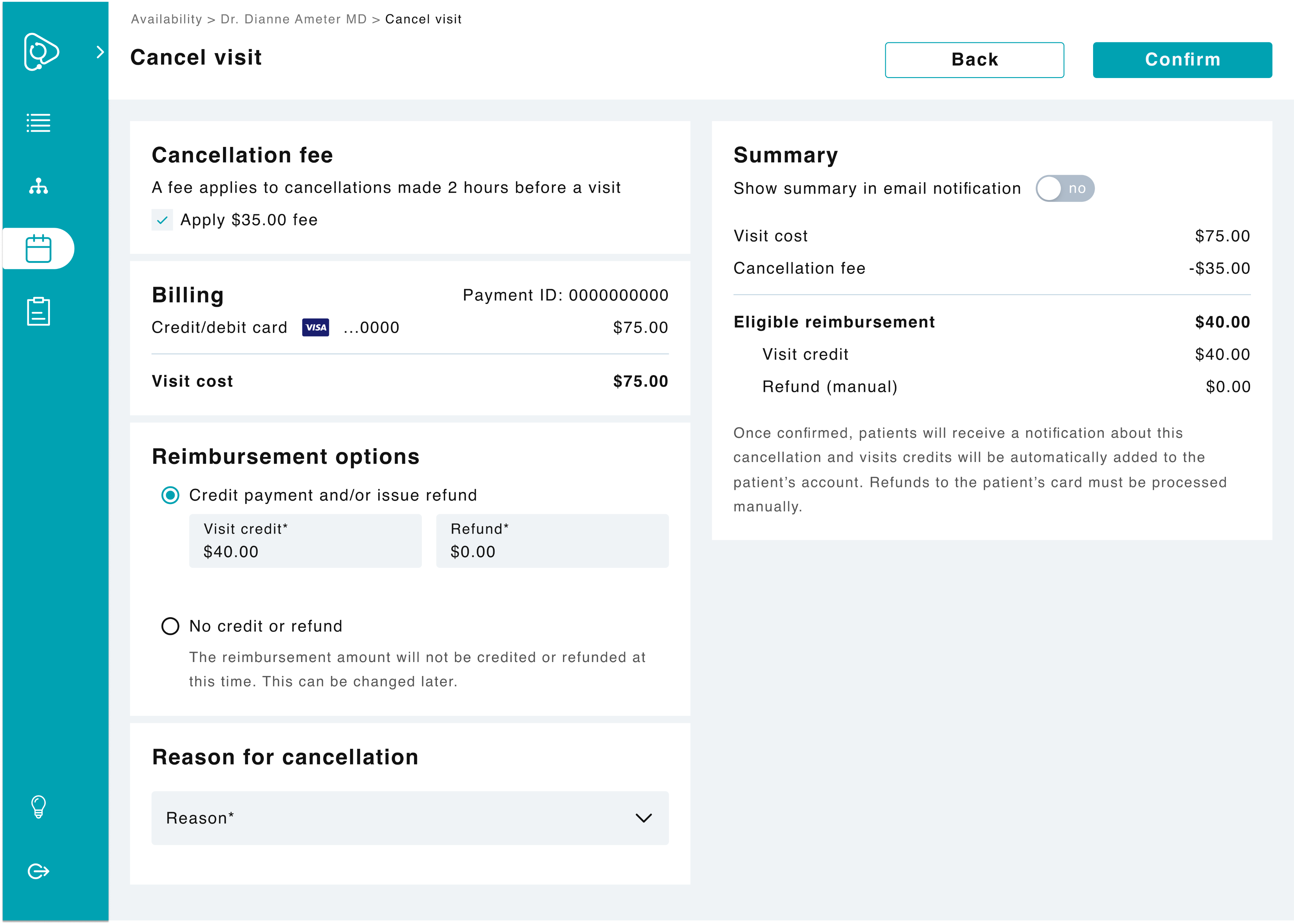
Cancellation page for visits with a fee.