
The Challenge
Tiny Tomo is a small pet business based out of SoCal that focuses on handmade pet tags. They initially reached out because they were having difficulties with providing a responsive experience. The hero banner would shrink while the button kept moving and obstructor parts of the copy at different breakpoints. Once addressed, it became apparent there were content gaps and lack of storytelling.

Sarah
Founder of Tiny Tomo

"The main issue is the sizing for the content between the web and mobile isn’t ideal. I’m not sure how to proceed from what it’s currently at."
Key Findings
Unresponsive website
As the breakpoint changes, the banner text becomes difficult to read and the button moves haphazardly.
Confusing callouts
Between the copy and image, it’s unclear what the business is trying to sell at a glance.
Tiny Tomo’s original homepage
Approach
1
Replicate the problem
There’s different channels an e-order goes through before it reaches the patient.
It was crucial to visually map the workflow to identify opportunity areas and articulately explain the problem/solution in critiques and to leadership.
2
Scope increase
As we explored solutions, we discovered there were different statuses shown to patients, providers, and the VA team.
By working closely with the PM and BE engineer, we consolidated all the statuses and identified what screens were being affected before adding new ones.
3
Pitch new content
I proposed a few sections that would help make her brand relate more to other pet owners and to highlight her unique value.
Once approved, I added the new sections along with copywriting that matched the brand’s voice and tone.
Results
An upgraded homepage that paints a clear picture of who Tiny Tomo is, why people should choose silicone pet tags, and what their policies are.
Check them out here.
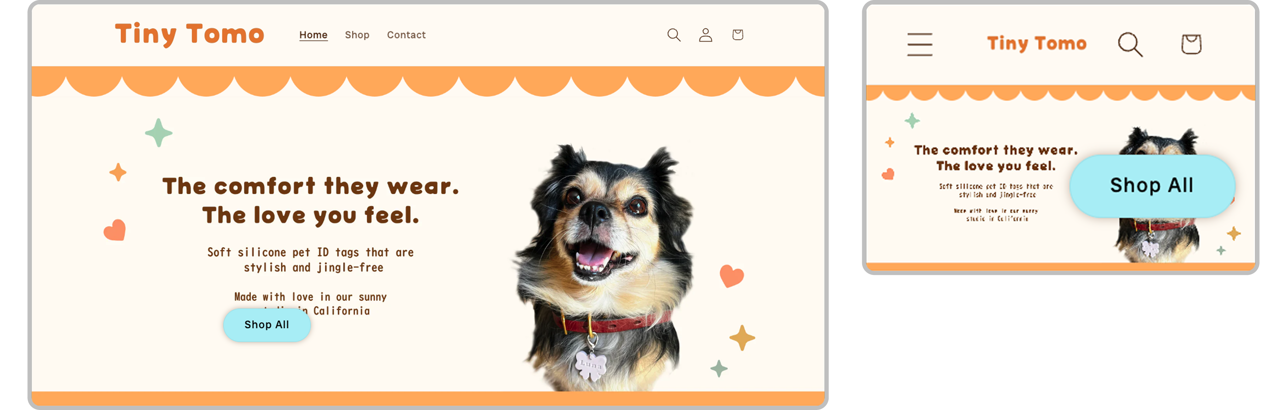
Striking homepage hero
Users can quickly get a sense of who Tiny Tomo is and see how they’re different with their soft shapes and pastel colors.
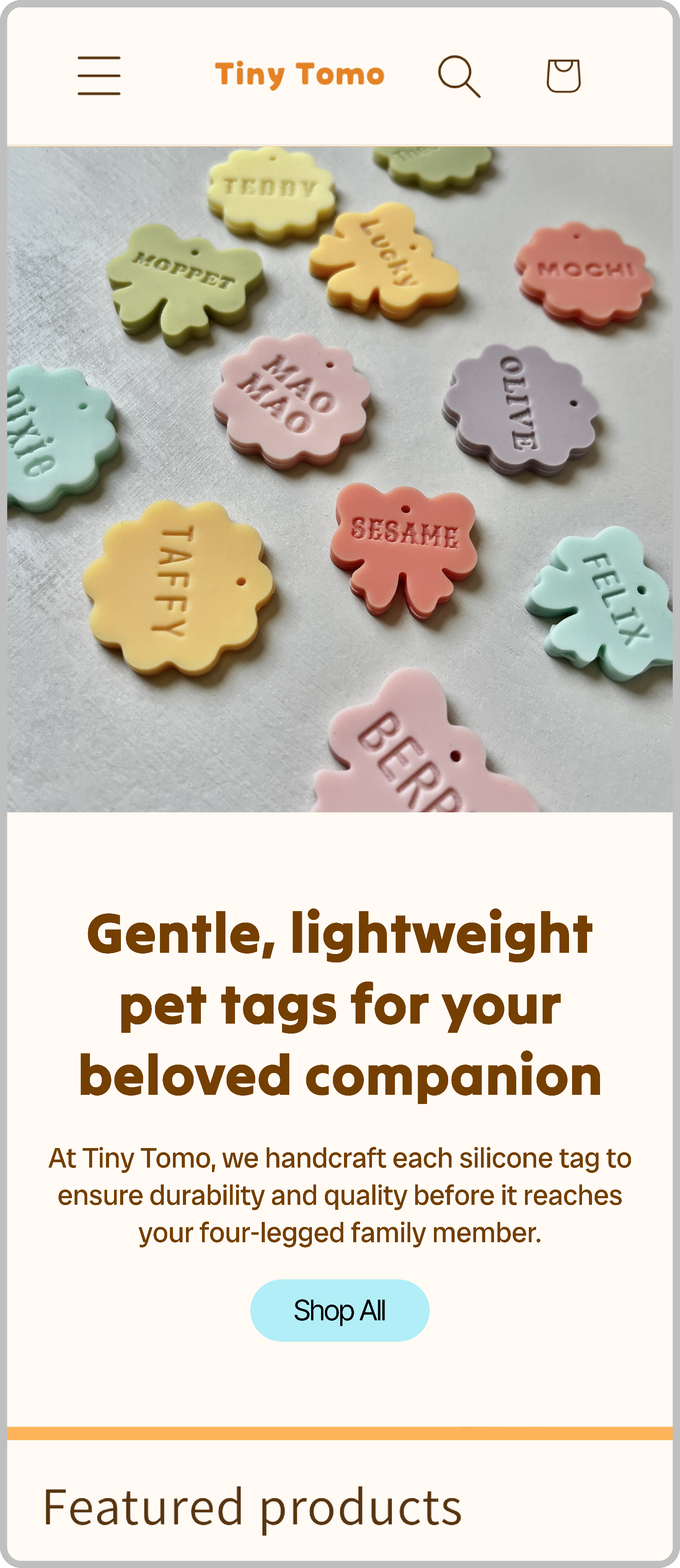
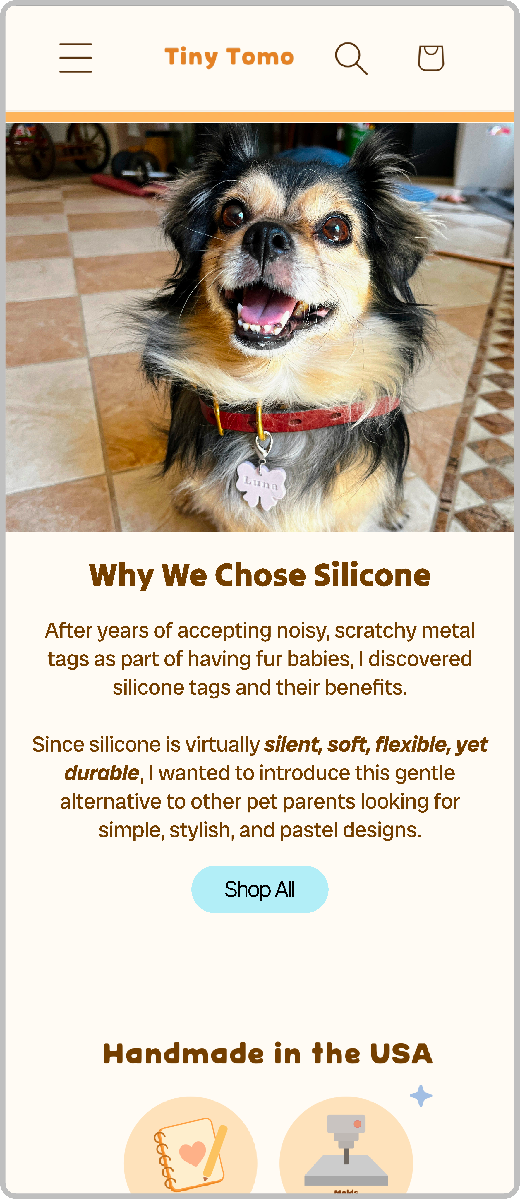
What sets them apart
The section helps the business relate to other pet owners who’ve faced similar issues and brieifly explains why silicone is the ideal material for pet tags since metals are common.
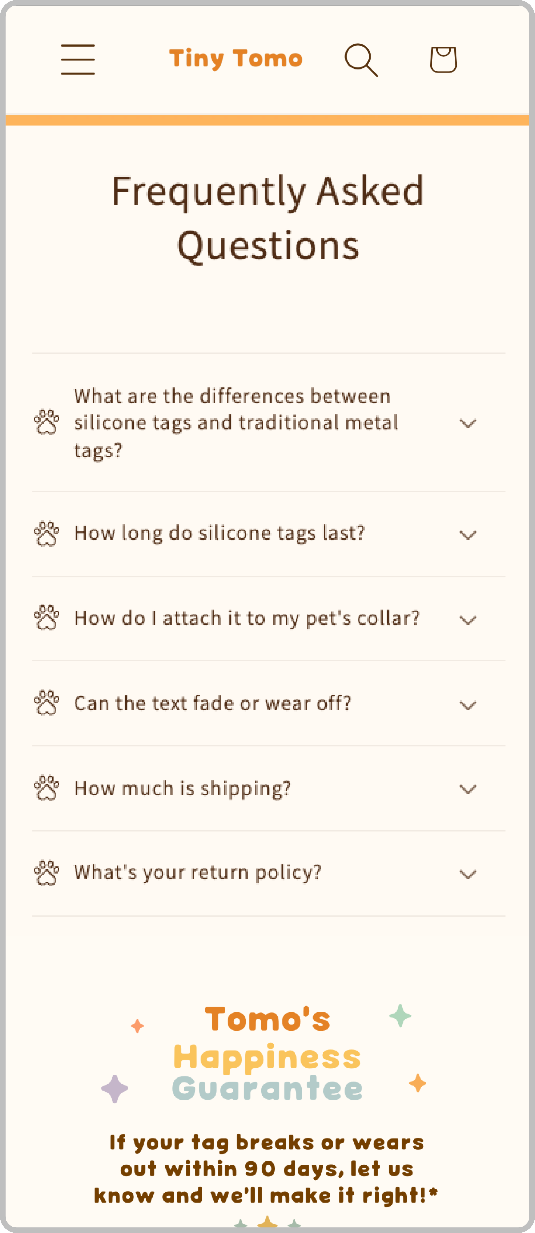
FAQs section
I added a FAQs section to help alleviate customer concerns before they even have them.
Since Tiny Tomo is a new business, it’s important to be transparent about topics around longetivity, maintanence, and pricing.